Data source comparison
PVsyst gives access to many popular weather data sources.
These show that the available weather data are far from being an exact science! There are big discrepancies between these databases, and it is very difficult to estimate which one is the best suited for a given project or location, and what is the probable error.
We have performed a comparison between a few sources for several locations to give a better idea on how weather data can vary from different sources.
Comparisons cannot be made rigorously, because of the variety of conditions:
- Not all sources are available for every spot on the globe. Some of them are for given locations, other ones perform interpolations or are for discrete grids of variable sizes.
- Climate variability: the sources apply for measurements of given years, or averaged periods which differ from one source to another (or even for one location to another, depending on historical measurements availability). Some weather data sources even make an attempt to predict irradiance and temperature conditions in the future, by using climate change models.
- Measurements: The analysis and validation of ground station data or satellite images involve sophisticated models which are constantly evolving and improving. The methods and techniques may vary from source to source.
- Available parameters: some of the sources do not provide temperature measurements (or they are not reliable).
Comparison criterion
For the comparison, we have chosen as reference the annual available irradiation [kWh/m²/year]. This parameter is relevant for PV grid systems, as the PV output is quasi-linear with the solar energy input. For other systems like stand-alone, the monthly distribution may also be of interest, but comparisons would require much more complex statistical methods. We do not show temperature results, which are of lower importance in PV systems.
In the comparisons, we mainly refer to the Meteonorm 8.1 data, which are the default data in the PVsyst version 7.4 database, and therefore likely to be used in any “first” simulation of a given system.
Comparison between several data sources for different continents
The following figures show comparison between five free weather data sources available in PVsyst for 9 locations in different continents. The graph shows the deviation from the average at each location in percent. The average has been performed over all five sources without any weighting.
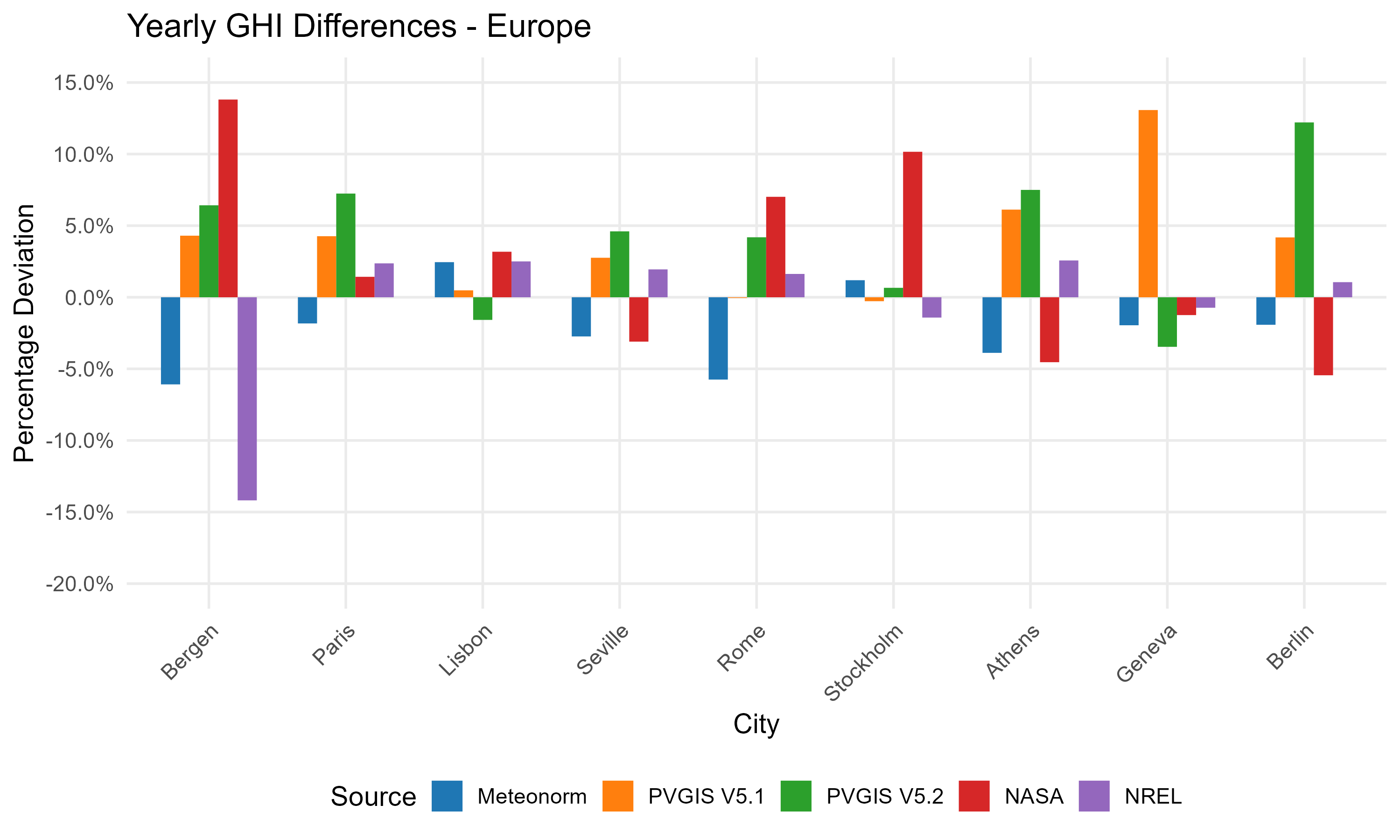 Comparison of different data sources for several European sites.
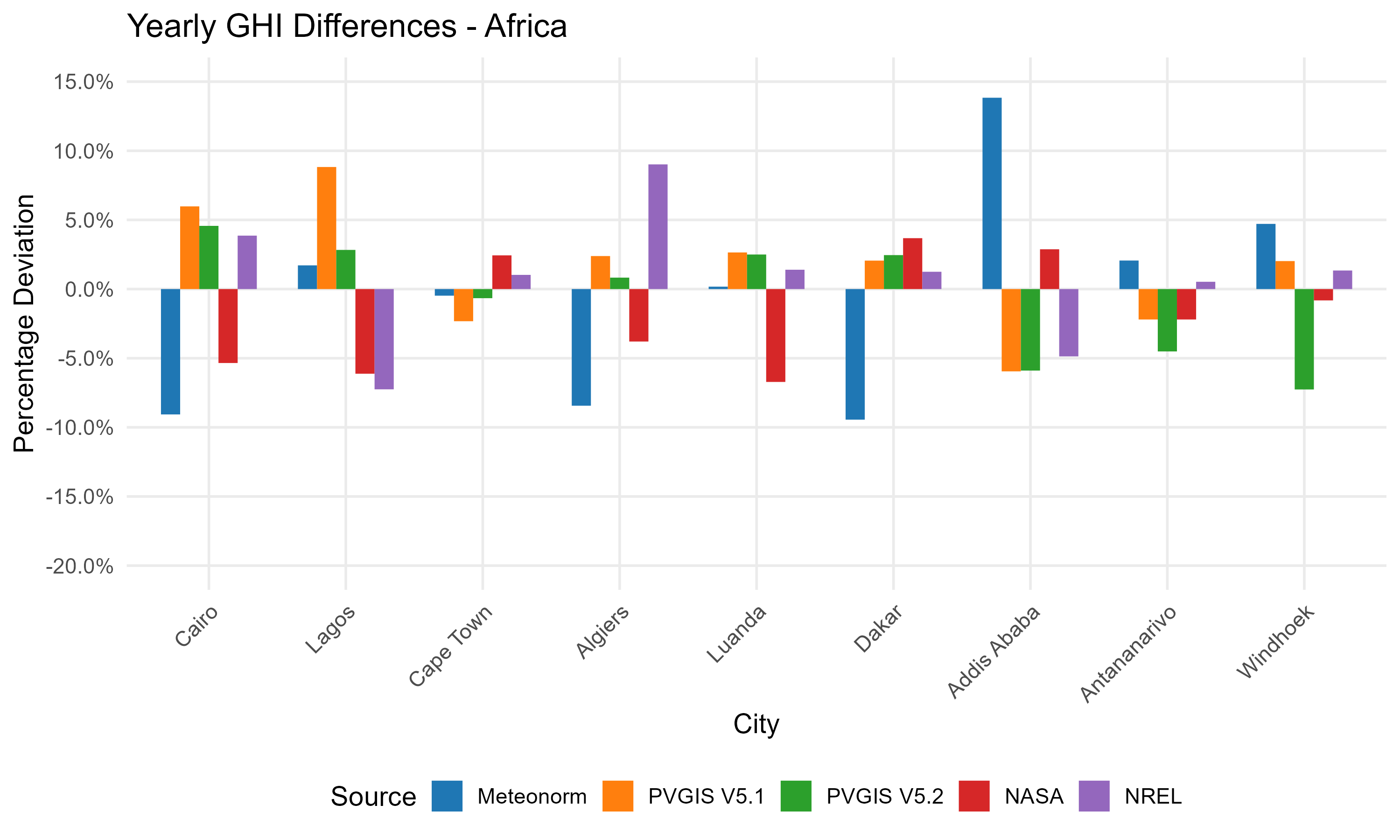 Comparison of different data sources for several African sites.
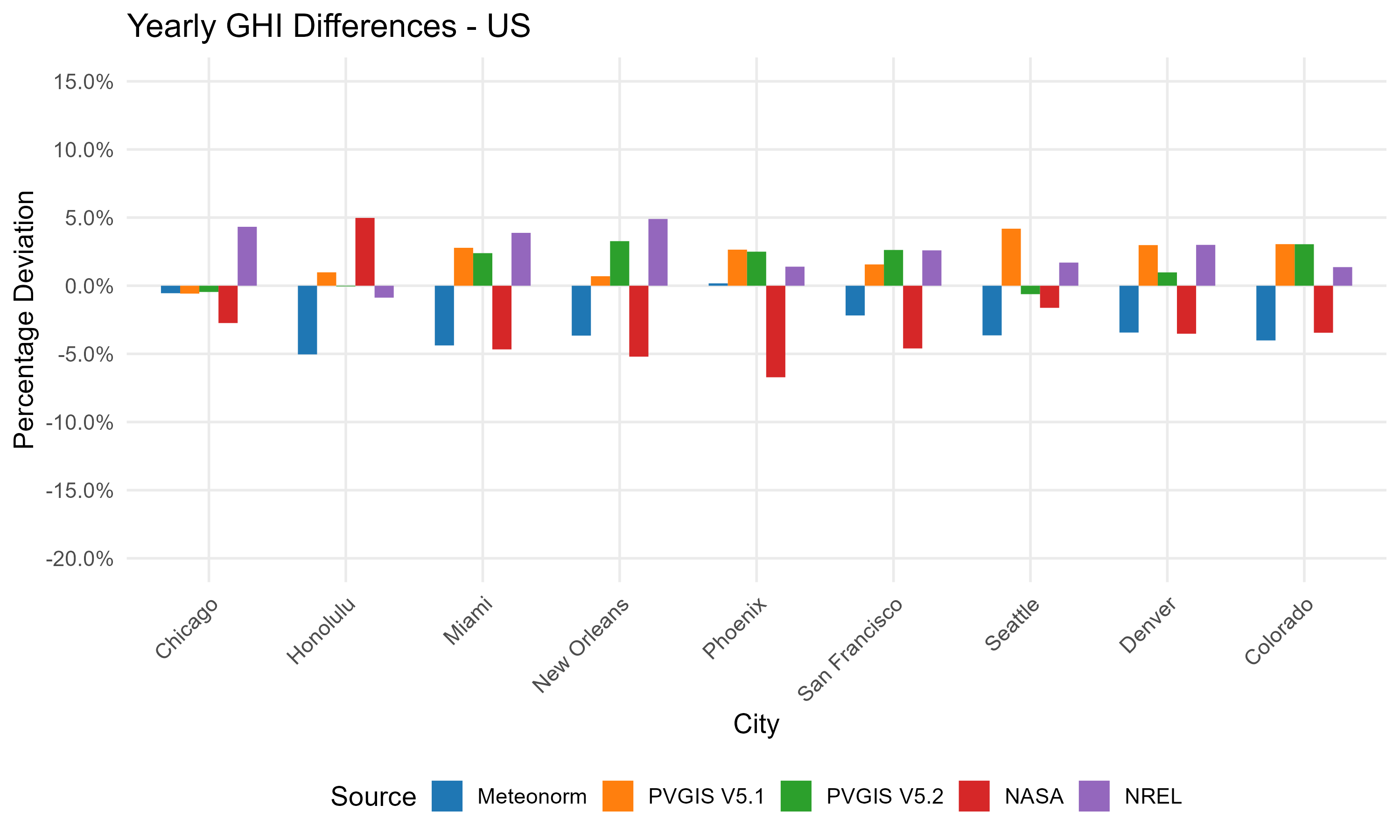 Comparison of different data sources for several American sites.
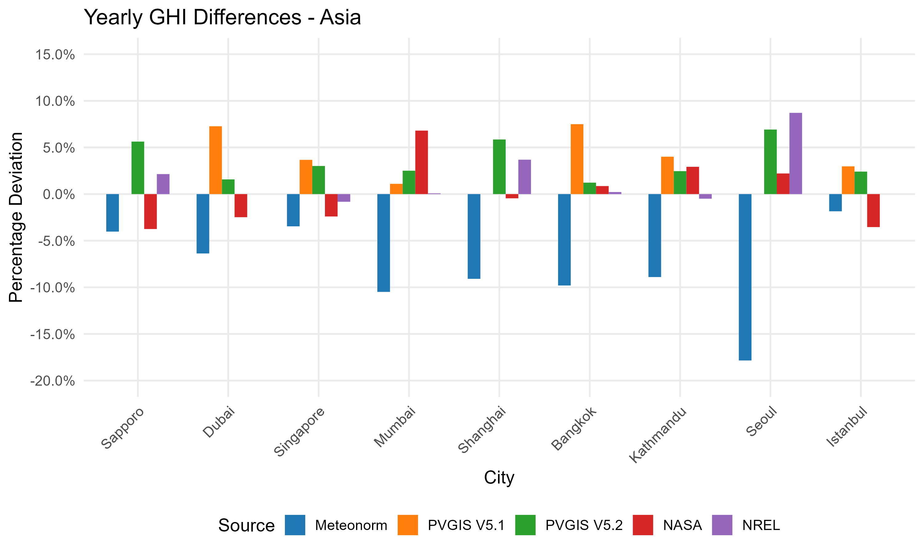 Comparison of different data sources for several Asian sites.
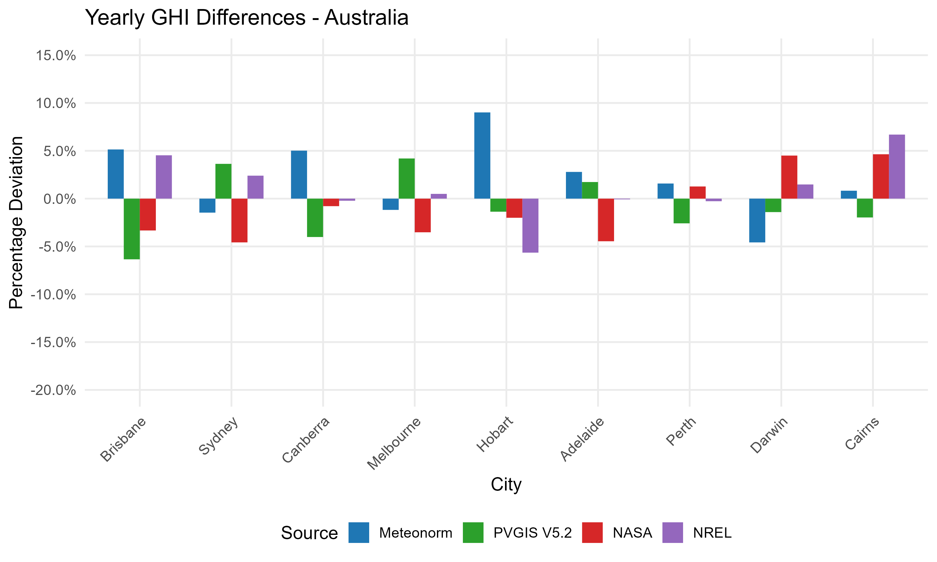 Comparison of different data sources for several Australian sites.
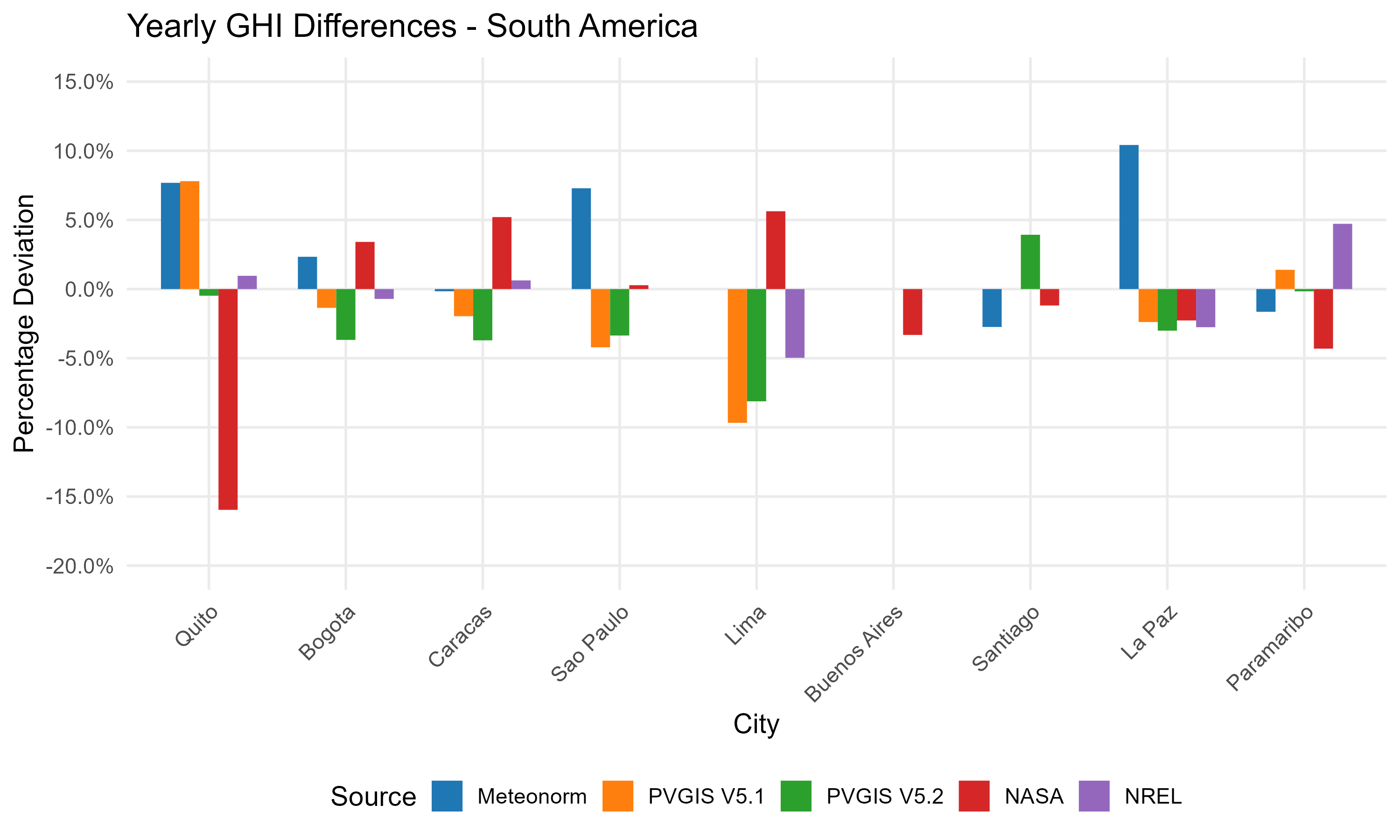 Comparison of different data sources for several South American sites.
A few conclusions can be drawn from the graph:
- Different sources typically concur within 10% of the mean value, demonstrating a high degree of agreement in most cases.
- It is challenging to determine which source most accurately represents reality, especially given that no one can reliably predict future climate changes.
- The variability and uncertainties in data from each source exhibit regional dependencies, suggesting that geographic and environmental factors significantly influence measurement discrepancies.
Changes within the data of the same provider
The providers of weather data keep updating and improving their databases and algorithms. As an example, the following graph shows values for the twelve sites of the European comparison for different Meteonorm Versions. Almost all values stay the same within a few percent, but for Barcelona and Sevilla one sees that significant corrections were performed between V4 and V6, and V6.1 and V7 respectively.
Changes like this can also be observed for other providers like NASA or PVGIS, although for different sites. In the previous plot, the difference between the PVGIS 'classical' values and PVGIS CM SAF is particularly striking. Although these values are based on two different measurement techniques (terrestrial measurements and satellite images), the provider PVGIS attributes part of this difference to a climatic change that took place between the end of the 20th and beginning of the 21st century. For the detailed explanation check this PVGIS page.
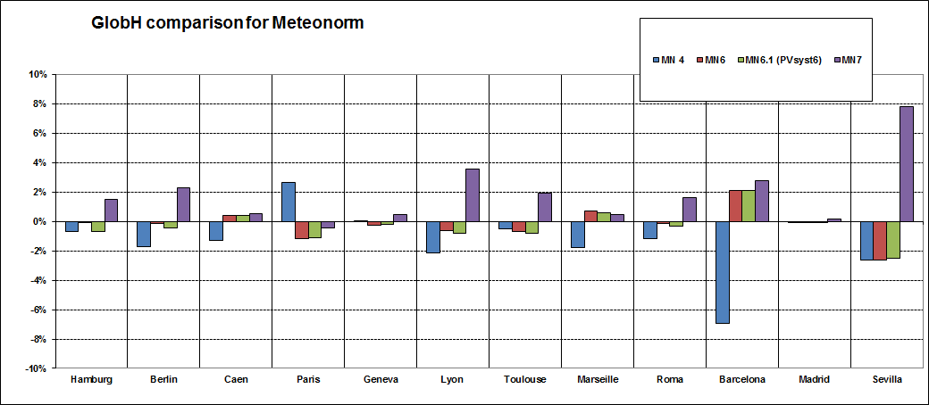 Comparison for different Meteonorm Versions
Yearly variations and climatic evolution
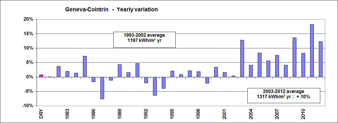
The following graph is based on a homogeneous sample of continuous measurements from the same source (ISM - Swiss Institute for Meteorology) for Geneva, from 1981 to 2012.
It shows that in Geneva, the annual variation of the global horizontal irradiance stayed well below 5% with only a few exceptions during 20 years. But then the average increased significantly since 2003, staying 10% above the previous value. This is not necessarily valid for other sites in Europe!
Comparison with other sources
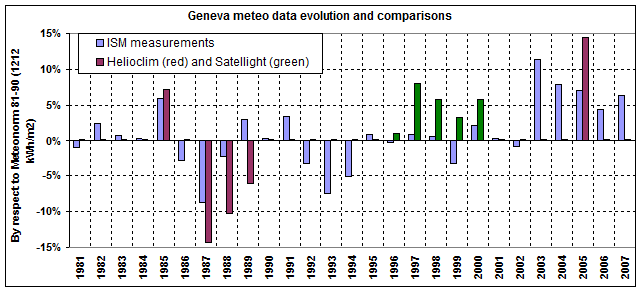
These ISM data, which we can consider as reliable due to the fact that they are weather data standard measurements, performed using calibrated pyranometers and corroborated with our own “scientific” measurements in Geneva since 25 years [P. Ineichen], are compared with the Satel-light (satellite) and Helioclim (from terrestrial measurements) data.
We can observe that the Satel-light data overestimate the ISM data by around 5%, while the Helioclim results are more chaotic (over-estimate the good years and underestimate the bad ones). The Helioclim-2 2005 values are 7.5% over the ISM measurements.
Satel-light data
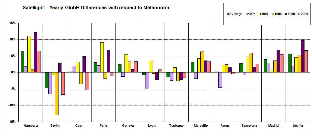
For other sites in Europe, the Satel-light data are always far over the Meteonorm ones, with one exception in Berlin. This exception is not attributable to the Meteonorm value; as we can see on the global comparison plot above, the Satel-light data for Berlin are significantly below the other Satellight data. We don’t have any explanation for that.
